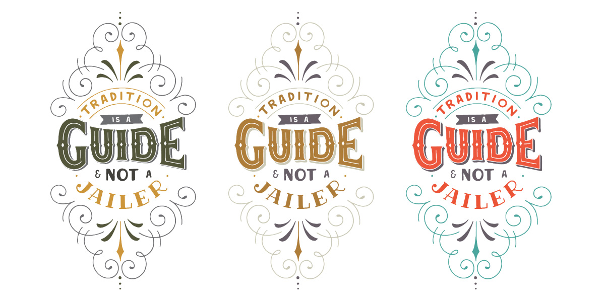
When studying any type of discipline that involves letters, whether it’s typography, calligraphy or hand-lettering, you will always encounter two types of letters – contrasting and non-contrasting letters.
Whether you’re new to lettering or you’ve been doing it for a while, learning about these terms will be beneficial to you. Have you been wanting to learn how you can create different styles or maybe combine them in your composition? If you are, you’ve come to the right place.
When you understand the difference between contrasting and non-contrasting letters, it’s basically knowing how many possible styles you can potentially create and make variations within your composition. Each type can be rendered in many ways, so take time to learn about it in today’s episode.
Now that you know the difference between these two types of letters, it’s time to put it in action and try creating your own styles by simply varying the thickness. Study each of the variations you’ll create and take time to practice and use them when creating new compositions. Come back to this post and share your progress with us!
As always, if you have any questions, let me know in the comments below and I’ll do my best to answer them.
If this tutorial helped you in any way, please share it with your friends! They’re going to love you!


comments +