It is a typical misconception that when lettering, you simply dive in and create your layout on the go. Well, there’s no rule that says you can’t do that so if that’s your thing go for it.
But, if you want to achieve the best result, create compelling lettering pieces, then you should avoid that. When creating your lettering composition, you should always be intentional. You need to stretch further than just creating one layout and finishing it. There are times that could work out but it doesn’t happen all the time, trust me.
If you want to get better you need to invest time in creating your work. Lettering, just like other disciplines that involve letters, is way time consuming because even if you’ve already learned the rules and the techniques, you will constantly be battling with composition.
So how can you achieve those beautiful lettering compositions? By using this tried and tested method – The Thumbnail Concepts.
What are Thumbnail Concepts?
Basically, these are just smaller drafts of lettering compositions and layouts. They aren’t well thought of. Most of the time, I use this to flush out all ideas in my head – how my composition should look like, how big the words should be, will they be slanted or curved, and many other possibilities. Use this to put everything down on paper so they are all out and I can visualize them better.
Are you familiar with the copywriting term “the shitty first draft”? It’s similar to that concept. They are called “shitty” for a reason – they are unedited, raw, they have no direction and they are fresh out of someone else’s head down to paper. That’s it.
So don’t expect thumbnail concepts to be pretty. They are just drafts, used to flush out all those ideas in your head.
Have you experienced working on a lettering piece and later decided to redo it and the second version looks way much better? That’s the same thing. Often, our first draft is just one concept and there are way too many concepts in our head that you haven’t put into action yet. This is the reason why professional lettering artists rely heavily on thumbnail concepts. It’s the very thing that keeps them apart from beginners and those who do mediocre work.
“Professional letterers invest time to create compelling pieces.”
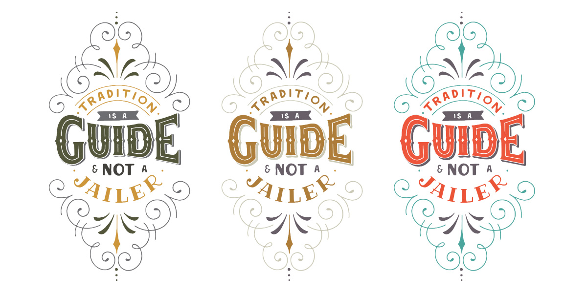
Today, this is what you’re going to learn. I’ll show you how I arrived at this final layout I did for Ironheart Press.
Step 1. Identify the requirements.
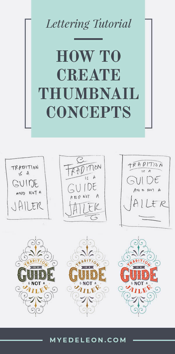
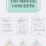
I was told I need to create a layout that would fit 11x17in board – that was the main requirement because it will be used for a letterpress workshop. Given that it’s a long vertical layout, I went on to create a rectangular base design which is typically my go-to layout. These were my initial sketches.
Step 2. Sketch all concepts in your head and put them down on paper.
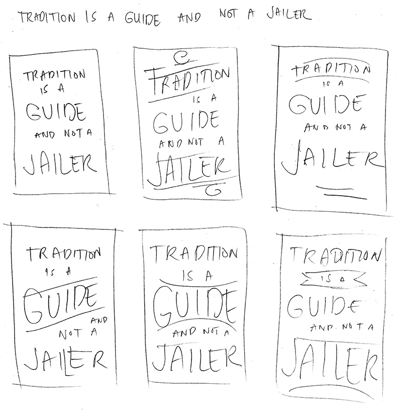
TIP 1: Your thumbnail concepts don’t have to be pretty! They can be skeleton sketches like the one above. Don’t spend too much time prettifying them. Use your time to put all of your ideas down to paper. Just like copywriting, there is a time to edit – your refining stage comes later.
It works on thumbnails but as I recreate something, it would appear like the words are far stretched out and it won’t look pretty if they are too big. They are good but not GREAT so I didn’t settle for any of these layouts. I went exploring on the possibilities for 3 days, wrote down all potential layout designs. In my head, I’ve used all potential rectangular concepts I can think of (wasted a ton of papers too). So I went back to the drawing board to re-think.
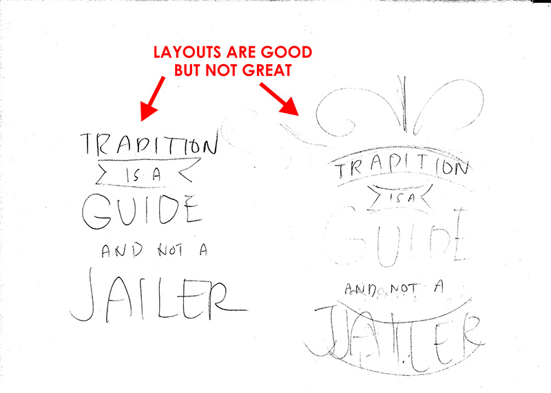
If you’ve done so many ideas and none of them seems to work out, think of the things you thought will never work out in the first place. In this case, I totally ditched the circular layout because I thought it’s a vertical layout and a circular one will not work out. So, I figured, why not try it.
Funny, because it only took me one thumbnail for it and I already knew it’s the one! The words perfectly aligned within the shapes I created. The only issue is it’s a circle design , in the center of a huge vertical layout. How do I make it vertical?
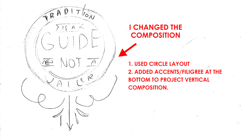
I started digging out all of my old thumbnails to get more inspiration and that’s when I saw this old layout. I figured I can use some concepts from this one so I started adding filigree on the initial concept. It’s coming together nicely so I decided to use this one and recreate a more refined layout from it.
Tip 2: Just because they are old doesn’t mean they can’t be useful. Keep your thumbnail concepts and layouts because you’ll never know when they’ll come in handy.
Step 3. Select the best layout and sketch it bigger
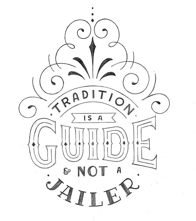
I added the filigrees at the top and the rest I just duplicated in the digital file because of its symmetrical composition.
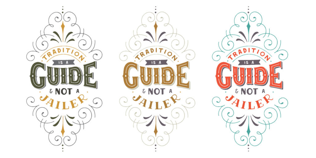
Even if you initially thought that something will not work out, you’ll never really know unless you try. It’s in the doing that we learn so many things so I highly encourage you to try it because it’s worth the time and effort.
“Don’t settle for mediocre work because they are easier. Those kinds of work won’t get you so far.”
Easy may do the job but it won’t make your clients or your audience craving for more! If you’re not growing your following or attracting the right clients, then this could be one of the things you can improve on.
Have you been doing thumbnail concepts or is this the first time you’ve heard of it? Leave a comment below and let me know. I’d love to hear from you!
And if this post helped you in any way, please feel free to share it with your friends!










it sounds to be a big help and I will try tomorrow. It is a shame that you are so far away. I would rather come to a workshop! I am in Germany😒
Thank you! I hope you’ll get to try it. 🙂
A very good advise, thank you very much Mye! I use thumbnail technique but seems just not very patient in it, I usually make only 2 or 3, should do more and dig deeper. Thank you!