


It’s very typical for a lettering artist to combine multiple letter styles in one composition. It’s because varying styles give additional impact and it adds to the overall appeal of the artwork.
But how does one choose which styles to combine?
Have you seen layouts with multiple letter styles where you can’t understand the message clearly?
Often, this is caused by too much inspiration from the internet, and some letterers simply copy the styles because it looks cool and pretty!
Someone might have told you to limit the number of styles to 3 to be safe. That’s good advice, but what if you’re someone who likes to play with different styles? If you simply want more than 3 in a layout, how are you going to make it work?
In this technique, I’ll show you how to carefully choose styles to combine in your layout without sacrificing your message.
Let’s study the following layouts:
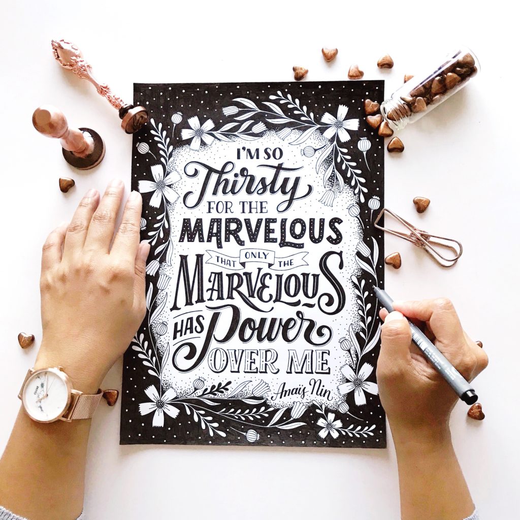
If you aren’t looking purposely at the layout, it looks as though it only has 3 styles. But look carefully:
I’M SO, THAT ONLY THE, HAS – are contrasting sans-serifs. By contrasting, I mean letters with both thick and thin strokes.
THIRSTY, POWER – are in script, in a slightly brush style lettering.
FOR THE – is a hairline serif.
MARVELOUS (1) – is a non-contrasting sans-serif with dotted inline. Non-contrasting means that the thickness in each stroke of the letters are the same.
MARVELOUS (2) – is a serif in my own personal style.
OVER ME – is a bracketed serif.
Having carefully analyzed all the styles I’ve used, there are 6 in all. This is one of my Instagram posts with the most engagement, my most-shared pin in Pinterest (so far) and it has been used in a gallery exhibit. So how did all the styles come together?
Let me break it down for you.
First, let’s discuss the sans-serif. There is contrasting and non-contrasting. However, sans-serifs are simple and they don’t have accents so they typically go well with other styles regardless if they are contrasting or non-contrasting.
Second, the script. The style is the same throughout the print, so no issue there.
Third, the serifs. This is where the complications always happen. Serifs have many variations and if you’re not careful, having too many in a single layout could make or break your composition.
In this particular layout, I used 3 different serifs – hairline serifs, bracketed serif and a serif that I styled personally.
Hairline serif – is the simplest serif form and it goes well with nearly all other variations of serif.
Bracketed serif – has endpoints that are pointed.
My Styled serif – has majority of its endpoints pointed.
Because of these combinations, your eyes are telling you that there are just 3 styles instead of 6. The sans-serifs blended well, there’s a script and the 3 serifs are blended because they have similar endpoints – POINTED.
“It is important to study the characteristics of letterforms because they help you make conscious decisions when choosing styles for your layout.”
In this layout, the styles complement well and it adds to the appeal of the composition.
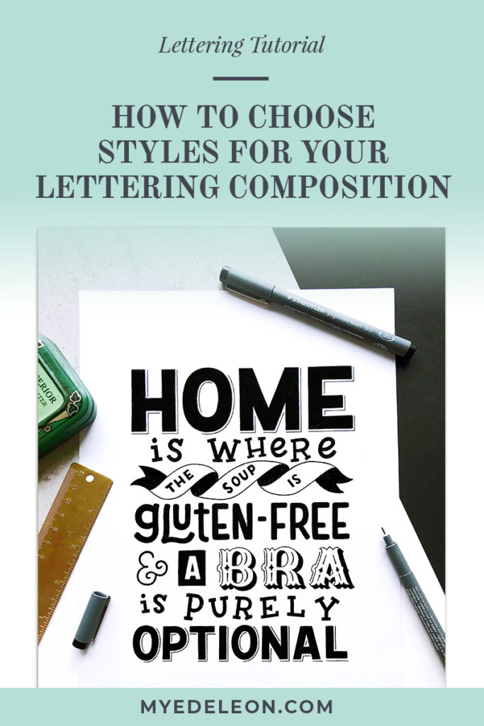
Let’s analyze our second layout:
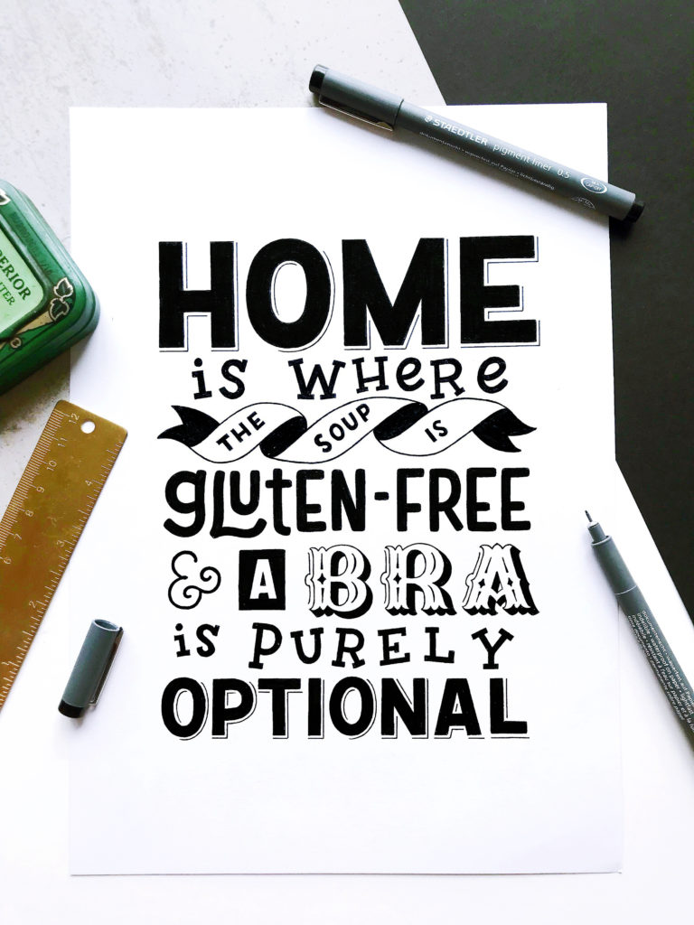
HOME, THE SOUP IS, A, OPTIONAL – sans-serif
IS WHERE, IS PURELY – slab serif
GLUTEN-FREE – slightly rounded sans-serif
& – monoline sans-serif
BRA – trifurcated serif
There are 5 styles in total but visually, it looks like there are just 3 styles. Why?
The serifs in this layout are different styles and you can immediately identify them. That accounts for 2 styles at first glance.
What makes this layout work well are the sans-serifs, which are all non-contrasted thus, complementing each other.
“The key is to understanding the letter structures and carefully selecting styles that best complement each other so they look aesthetically pleasing.”
When I was a beginner I liked to experiment with combining different styles without paying attention to the letter structures. Some layouts ended well, some did not. Over time, I was able to tell what would work well and I’ve developed my own technique in creating compositions with multiple styles- simply because I love to use more. You know, pretty stuff.
If you are new to composition, I suggest start studying different styles. Letter them side-by-side to see if they work well together. If not, try other styles that may work and you will be amazed by the possibilities.
If this tutorial helped you in any way, please feel free to share this post.


Hi Ms. Mye!
Really enjoying reading your blogs:) Thank you for the daily dose of inspiration. Hugs!