")


There are rules in handlettering that you need to learn and understand in order to deliver quality artwork. These rules, though you may find restrictive isn’t to restrict you in any way. These rules, should be treated as guides so you can create letterforms that are not only pretty but legible. Or have you forgotten why you are doing hand-lettering in the first place?
We often think handlettering is a hobby and while it is, there is a broader meaning to why we are doing it – TO COMMUNICATE. If you fail to do so, then your lettering didn’t do its job well.
Now, we aren’t discussing all the rules here today. Instead, we’ll talk about the the thing that don’t typically get too much attention in hand-lettering, the TITTLE or the DOT.
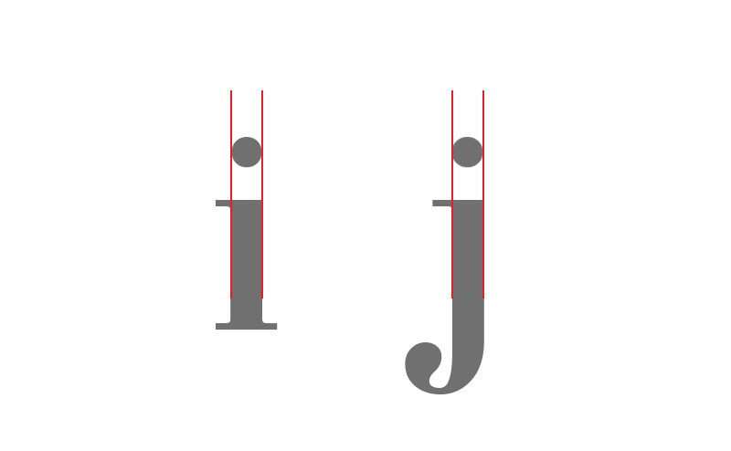
If you don’t know what it is, it’s the dot on the lowercase “i” and “j” – often, neglected and gets less attention.
It’s just a small dot, what more do we have to know about it?
If you have downloaded the Styling the Alphabet Free Course, you may have stumble upon this term already. If you haven’t, I highly suggest you click here to download it.
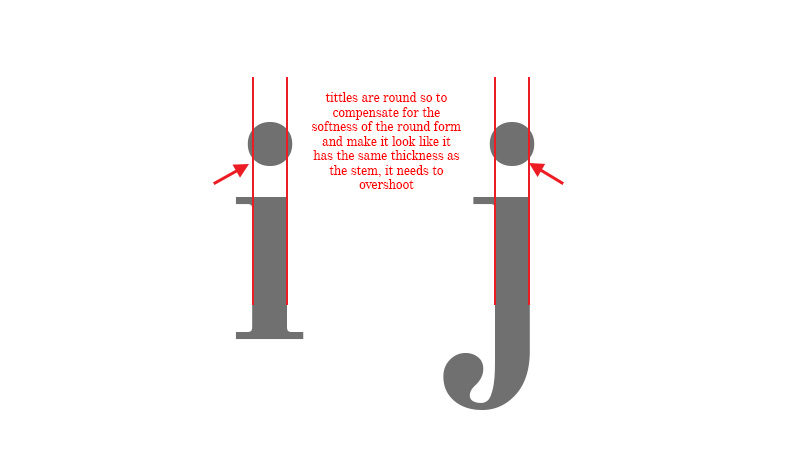
Now, in the course book we discussed about overshoot for curved and pointed letters. However, there are other parts of the letters that needs overshooting – it’s the TITTLE (or the dot)! This part is specifically for lowercase I and j only. Despite being applicable to just two letters, we shouldn’t ignore the fact that we need to know about it.
Overshoot applies to all round (C, G, O, Q) and pointed letters like A, V, W). It’s the degree to which the strokes are extended slightly higher or lower than its flat counterparts (like E, H) to create an effect that they are of the same height.
If you’re one who loves drawing lowercases, this is for you.
Remember the whole point of overshoot? It’s to make the round and pointed letters look like they are of the same size as their flat counterpart. In the case of lowercase I and j, it is to make it look like they have the same thickness.
Look at the examples below.
When the tittle is created at exactly the same thickness as the flat counterpart, it looks as though it is thinner and smaller. That should not be the case. Your job as the designer is to create the letters so that they appear to be optically equal in size.
Below is an example of a better-designed tittle.
Now, that we know it, it’s time to start changing our designs!
Was this the first time you heard about lettering tittles or dots? Tell me in the comments, I want to hear your opinion about it.
If this tutorial helped you in any way, by all means forward this to your friends too!


I learnt such a valuable tip. It just took such little time to read and register in my mind. Thank you.
I’m glad you liked it Swetha 🙂