
One of the most difficult things about lettering is the spacing. In general, we pretty much just eyeball everything and go with the natural flow of how we draw our letters and words. But that’s actually not enough. What we think is ok can sometimes affect our artwork in a negative manner and we have to avoid those. This is why we keep educating ourselves about lettering.
The key to creating better hand-lettering work is understanding Kerning, Leading and Tracking. These are typographic terms, and yes, sometimes can be so confusing. Adjusting the letter spaces in typography can be done in Photoshop, Illustrator and inDesign (and other applications) under character and paragraphy styling. In hand-lettering, we do it manually, by repetition.
Why is it important to learn about these?
Whether you’re a lettering artist or you want to be one, it’s important to learn about the letter spacing because it is an integral aspect of your design! Say, you want to turn your lettering into fonts or type. If you have knowledge of the fundamentals, you will better understand how to create and produce better fonts. In addition, it is also a huge factor when you are talking to your clients and you talk using design and typographic terminologies. This gives an impression of authority and professionalism. Understanding these terms, and knowing the parameters to create and space your letters always lead to better design work.
Below is a simple explanation of how these terminologies differ from each other.
 Credits: Mastering Hand-Lettering
KERNING
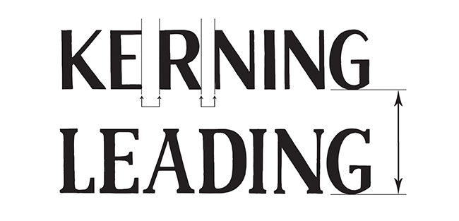
Kerning is basically, the adjustment of spaces in between individual letters. If the letters are too close or too far apart, they are harder to read. An uneven spacing, on the other hand, results in a poorly design work.
Credits: Mastering Hand-Lettering
TRACKING
Tracking on the other hand, is the spacing throughout the word/s. Typically, it is done when you need to fill in a space that may be wider or smaller. Consider it as the area for which you need to fit your word or words in. If you have a wider area and short word, your letters will have to be wider or you might need to space the letters far apart. On the other hand, if you have a smaller area and longer word, your letters will have to be narrow and closer in terms of spacing.
Credits: Mastering Hand-Lettering
LEADING
Leading is the space in between baselines, like in a paragraph. When you have multiple lines of texts, you need to check how you would place the lines apart. Spacing them too close or too far may affect the legibility.
Credits: Mastering Hand-Lettering
Now, the most common question I get whenever I talk about these in my workshops is how to measure the spaces. Using software like Photoshop and Illustrator, you can do it by adjusting the numbers up and down. In lettering though, there’s no exact mathematical formula to do it. You need to be able to discern how much or how little you need to adjust each of the letters or words.
At first, it may seem difficult to do but it is learned through repetition and practice so do not get discouraged. It takes a while to learn these things just like lettering. But you get better as you go through the process. Trust in it and trust in yourself. Do more, fail more then fail better. Until eventually, you can pretty much eyeball everything and design flows more naturally to you.
If you want to dig deeper into typography or you probably want to study it further for type design, you may refer to typography books such as:








comments +