


One of the many questions I get is how to get consistent letter thickness.
For a long time, I was really just eyeballing everything. I had no tools to define the thickness altogether. All I knew was that if it didn’t look consistent to me, then I need to make some adjustments – that’s it.
However, when it comes to precision you need to clearly see the minuscule differences.
This is most often needed when creating logos or designing type, because they have specific design requirements and precision is one of them.
When I held my first online course, Lettering Mentorship, this same question had been asked a couple of times so I’m sharing it here.
You can watch this short video I created for you and read on below for additional instructions:
First, I use my circle drawing templates which I purchased from a local bookstore. If you don’t know what they look like, check the image from Amazon below.
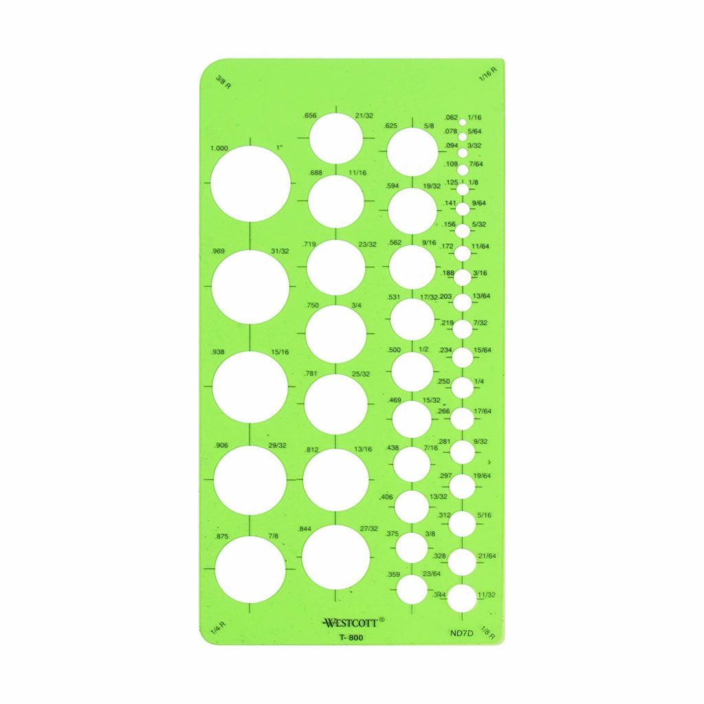
Circle Template from Amazon
Then, I carefully draw my letters and add thickness to my strokes. Sometimes I’ll get it correctly, but most often there is a tiny difference that a trained eye can spot easily.
This is where my template comes in.
- Use one stroke as reference
- Use a circle template that exactly fits inside the thickness of the stroke.
- Draw a circle inside the stroke and use it as reference for the other letters
It’s that simple!
Now, other letterers measure their thickness by ruler. You can do that too. Find whatever is more comfortable for you and do it.
For me, it’s this method. Simply because I find the little circles cute 🙂
Don’t you?
For more lettering lessons, you may download my Free Lettering Course
——–
P.S. I learned this tutorial from a fellow lettering artist and friend Scotty Ruselle of @prspctv_collctv for use in vector lettering. It was fun trying it out in analog though. If you happen to be on IG, check him out, too and his inspiring Perspective Podcast!


That’s such an easy and nice trick! Thank you : )
Glad you like it 🙂
Great tip! Thank you 🙂
You’re welcome. I hope you can try it.
Thank you so much for the tip! I will definitely give it a try.
You’re welcome!